Edited Excerpts
Q. Tata Nexon is the best-selling compact SUV. While designing the facelift what kind of pressures you had to retain the old character and put the new elements in?
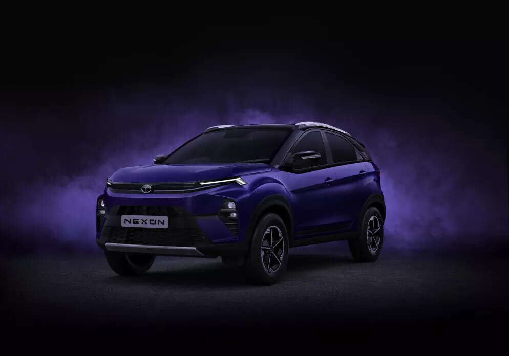
We wanted to make this car much sharper, crisper, and of higher quality, which means a technical leader, really, a high-tech SUV. So when we designed it, we redesigned the rear completely. We redesigned the front, so it’s more than a traditional facelift. So we made a new bonnet, new fenders, new headlamps. All of it was being driven by making the car really like an avatar or an innovative customer.
Q. What kind of changes have you made to the interiors to make them more aspirational and sustainable?
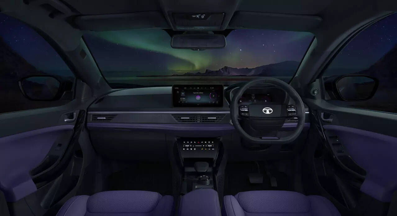
Yeah, when we looked at the Nexon, obviously the car has evolved overall in terms of design and development, and we didn’t want it to come across as an analogue product. It’s still capable as an SUV, but at the same time, the interface the customer has, has really changed. The whole landscape of the interior in terms of how you interface the UX, UI, and then how do you look at that has changed?
The steering wheel, for instance, has a completely new, very unique approach. It’s more like a games console now. And at the same time, we really wanted to improve the quality. So everything is very fine and finesse and, of course, also the materials.
Not just colours and fabrics and stuff like that, but the plastics, how they’re done, everything is very sharp, very well fitted, and it adds a certain level of premiumness and then, of course, quality.

Q. You mentioned the two spoke wheels. Take us to the story behind it and how it came to your mind that we should have a two-spoke steering wheel in a compact SUV and that too eliminating logos, going away from the traditional metal logos that we have been seeing in the cars.
Well, we’ve seen the trend in terms of logos. We’ve seen the trend that logos are becoming flatter because they’re becoming a platform for digital content.
So it doesn’t matter if it’s an automotive company or any company. They’ve redesigned their logos to be flat, so they’re no longer 3D. When you look at the 3D logo, in many ways it comes across as aged.
Now it looks like an analogue industrial product, whereas we are now in a digital economy and a digital society. When we started a simple task like designing a new steering wheel, the designer in question did a whole image board of games, consoles, PlayStation, Xbox, and whatnot? He said, this is the console of how you interface with all of these screens, how the infotainment, the climate control, and so forth. Why don’t we approach it like that? And of course, immediately the product shifts in personality by making this different approach. It’s no longer a mechanical product.
Q. How did you fit in the airbag?
Well, that was the challenge. I mean, we came up with this great idea, great sketch, and then, of course, the first thing was like, how does this work? And you want an illuminated logo as well, so it’s backlit.
Yes, we worked very hard and long, I mean, of the better part of two years. So the designer who got his steam pick, the guy who I mentioned, won the lottery, but also he was condemned to two years working with the suppliers and the engineers to make it work. But in the end, they got the result coming back to interiors and the dashboard specifically, it’s really minimalistic.
Q. In the Nexon facelift, the interiors are very digitized as you can see is only a screen and very few buttons. Screens tend to distract you while buttons are more intuitive. What is your view on that?
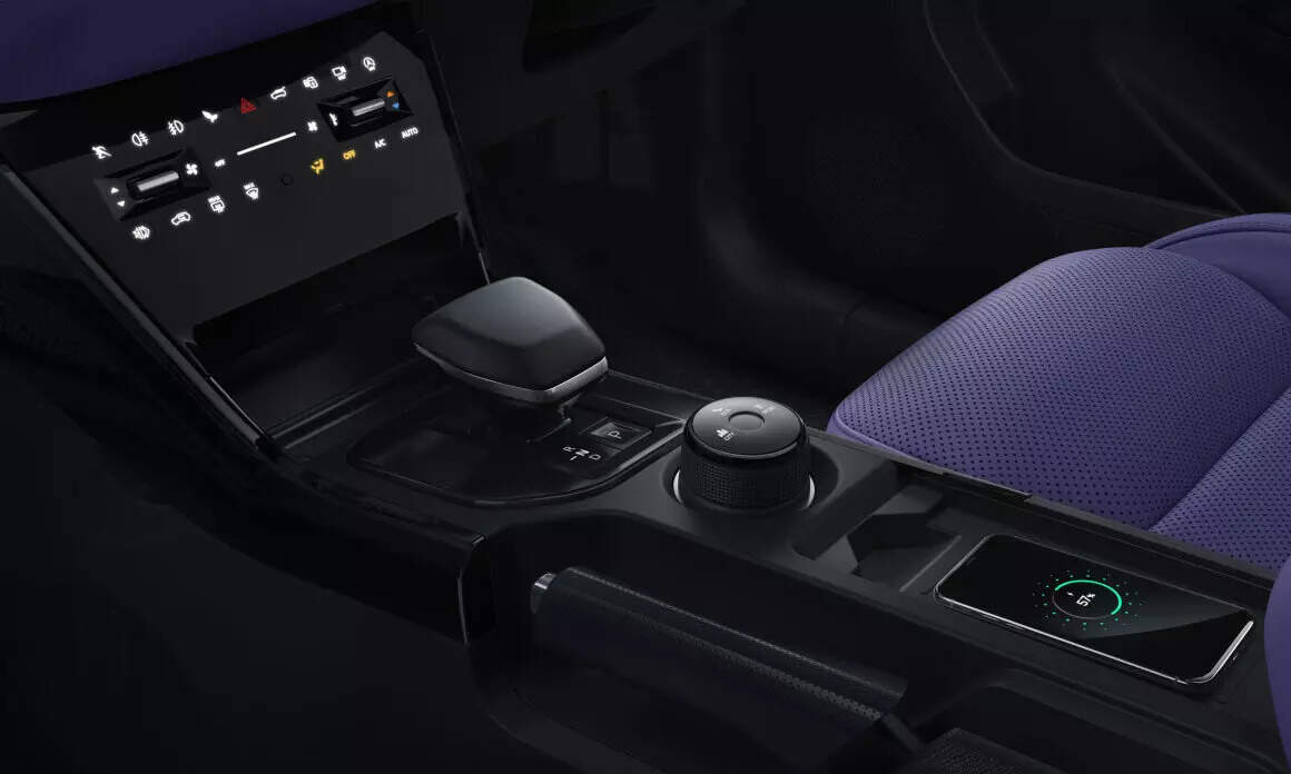
First of all, this is a philosophical approach, design-wise, where we’re like reducing visual clutter, reducing the buttons, I think customers are now more attuned to basically a capacitive or a touch screen thing. So certain functions are mechanical, so we still have certain mechanical switches which are, from a safety point of view, important. Then other ones are the ones which are secondary.
Those ones are now basically de-contented visually. The other thing is, it’s a huge cost-saving for us, so we have more money to spend in other areas. And you’ve seen we previewed this sort of approach in terms of the touchpoints on the curve on the Sierra.
And so that’s very much like our interior design philosophy. Then, when it comes to our screens. Distracting.
Yes. I think you need to have just the right amount of screens to communicate, whether it’s information for the driver, speed, safety range, things like that, or in the infotainment area, what, music, navigation, things like that. But it shouldn’t be completely distracting.
I don’t think we’re going to be doing an end-to-end screen IP, for instance, and then you’ve seen with the Avinia, for instance, we reduce the screen considerably. So we actually think that the trend long term, especially from a luxury premium point of view, is to almost de-content it. There are screens there, but it’s not screen-centric.
That information is important and you have to communicate it, but at the same time, it shouldn’t be in your face, and it also becomes an arms race. Also, it’s because the customer wants to have the digital experience that’s right. Screens, phones, laptops.
But at the same time, how much is too much? I’m always telling my kids, get off the phone. You’re looking for enough screen time. And so I think just the right amount of information is the right balance. Of course, whatever emboldens or entertains, you are perfect. But then at the same time, there’s a balance.
Q. Could you take us through the persona strategy that Tata Motors is playing in terms of going away from the variant verticalized approach to the horizontal approach?
That’s right. As you mentioned, traditionally, the trim levels were a vertical approach. So you had, like, high, medium, low. If you bought the low, maybe that was your choice, maybe that was what you could afford. Maybe that was enough for you, which is fine.
But visually, they always came across as a sort of second-class communication. And so we said, there shouldn’t be a stigma, there shouldn’t be a hierarchical approach to trim levels. So we rotated it.
We said it’s horizontal, so it becomes a lifestyle choice. So we framed them with personas. So we’ve already done that with the punch.
And now with the next one, we’re really taking it to the next level. So you pick pure, creative, fearless. Which one is your avatar? Which one fits you the best? For instance, I’m very pure, so that’s the one I would pick.
But at the same time, you can buy tech packs. You can spec up the pure, you can get the larger screen, you can get the nice wheels and so forth. And then basically, you configure the car to what works for you.
And when you go on the configurator later on when we have the car on the website, you can essentially design and curate the car yourself. But there are certain controls. Make sure that all of them come across. Once you’ve configured it, it all works from an aesthetic point of view. There’s no oddball coming out at the end.
Q. With the new persona strategy, how many combinations or variants will there be for Tata Nexon?
If we do all the metrics, I don’t know how many combinations, but it’s a lot. I know that there were a lot of nervous people when this was being proposed, but ultimately, you have to offer the customer what’s correct and what they need. And you can’t really design one car for everybody anymore. You have to offer a menu of options and let people curate it.
If you look at our phones, whether you have an iPhone or Samsung, ultimately the phone is pretty universal. But the apps, your screensaver, that’s you, that’s what you need. Whether it’s your family or where you’ve been as a screensaver or the selection of apps, the same thing comes with the car.
The car is only the beginning of the platform. The customers are ultimately the owners of the vehicle, and they will curate it and make it for their own.
Q. What is your view on the future of car design? What kind of cars will we see in the next ten years? The evolution that will happen?
Definitely electrification is accelerating. It’s a very different experience, driving experience, dynamically.
I’m of a generation that was a petrol-head generation, where the engine sounded visceral, that was part of the experience. As we go into electrification, it’s a very different driving experience and, of course, it influences the design, aerodynamics, efficiency, and so forth. I’m always very conscious that the cars don’t become anonymous, that they become characterless, that they’re very capable, very competent, very safe and reliable, but that they lose their soul.
I think the biggest challenge for us is offering products that have character, are exciting, have emotion, and then, like I said, are engaging. That’s the key, isn’t it? Engaging. It has to be a positive experience.
As we develop, it could be any product. While design is the one part for EVs, making the sound, having those yeah, but it’s a very unique I mean, I’m driving EVs now as well and I actually very much enjoy it. It’s very stress-free, I find it very calming and all this sort of stuff, but you can make an engaging EV, so watch this space.


